Live Data Plots -- Sulzer 2.5 Standard vs. WWVB
Unfortunately, the live data capture experiement has been halted temporarily while the N8UR Bureau of Standards is packed up for a move to a new basement. It'll probably be mid-October before things are running again.
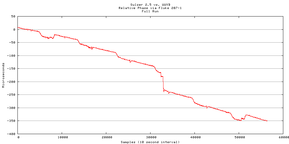
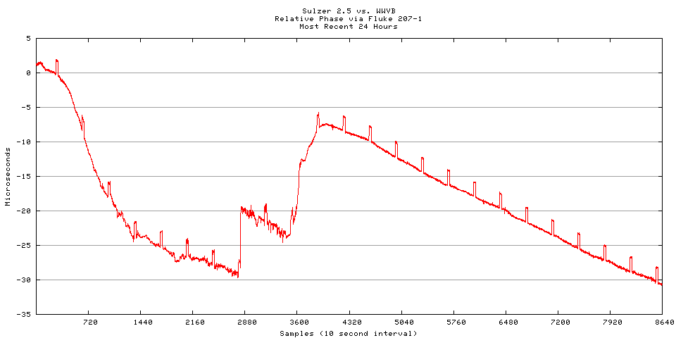
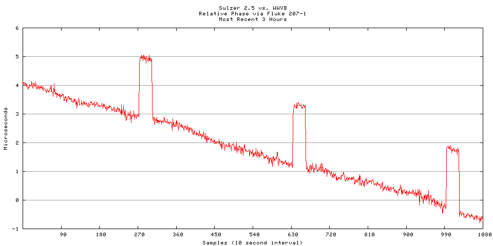
These plots were captured using a Fluke 207-1 VLF Receiver/Comparator configured to monitor the relative phase of the local Sulzer 2.5 frequency standard against NIST station WWVB on 60kHz.
The data is captured from the chart recorder output of the receiver and fed into a 12-bit analog to digital converter ("ADC") with a resolution of about 2.4 millivolts. The receiver is used with its fastest tracking time constant. This increases the amount of noise on the plot, but improves the Fluke's ability to follow rapid phase changes; this has been a problem here during the diurnal phase change, when using slower tracking rates with longer time constants results in the receiver tending to lose lock when the phase changes more rapidly than the phase shifter can cope with.
The ADC card (an ADAC 5500MF) reads one sample per second and stores it to a disk file. To generate a plot, the disk file is fed through a simple program that averages ten input readings to generate one output value. This results in an effective sampling rate of one per ten seconds, which seems like a reasonable rate to show the information we're looking for, and greatly reduces the noise on the plot. I plan to experiment more with the combination of sampling rate and averaging period.
Over time, the phase change is likely to exceed the 10 microsecond range of the Fluke recorder output. When this happens, the data 'wraps" from the top of the chart to the bottom. This makes analyzing the data more difficult, and to get around it, another filter program processes the data to add or subtract 10 microseconds from the value, and then scaling the range of the chart, as needed to keep the data from wrapping (thanks to Tom Van Baak for the idea to do this).
Graphs are prepared by running "gnuplot" against the processed data file. A cron job on the computer runs a script every twenty minutes to generate the charts from the latest data available.
I've also started capturing an hourly phase value and some statistics. I'm doing this by capturing 300 samples (5 minutes) worth of raw data at 30 minutes after each hour, and running it though a simple statistics program. I'm still working on this; the longer-term goal is to use this information to automatically calculate the aging rate of the standard and other interesting stuff. The challenge is to ensure that the data is valid; it's amazing how easy it is to see anomalies on the chart, and how difficult it is to program around them. The phase data is preprocessed to remove outliers, and to do any "wrapping" necessary. Therefore, any errors in that process will affect these results; at present, there are still some glitches in my algorithm that cause spurious 10us shifts to appear, so it's not safe to compare the phase values over long periods of time without first looking at the charts. You can can look at the hourly phase data here.
I don't guarantee that the recorder will be running all the time. In fact, it's probable that it won't be up all the time -- I'm doing other experiments, or the data capture may have failed, or the world as I know it may have come to an end. The info below will tell you how recent the data is (the graphs will update whether the data does or not):
| The data file was last updated: | Tuesday, 15-Apr-2025 17:25:24 UTC | |
| The image files were last updated: | Tuesday, 15-Apr-2025 17:25:23 UTC |
If you'd like to look at the raw data, here it is (if your browser won't display it, you can right click on the link and do "Save Target As" to capture the file to your machine). This file grows at the rate of one line per second as long as data is being recorded, so it may be quite large. You've been warned!