Frequency Measurement using VLF Radio Signals
How do you know whether a frequency standard is on frequency? You compare it with another standard that's known to be accurate (or at least, more accurate than yours). Ultimately, you trace frequency calibration back to the source, which in the US is the master clock at the National Institute of Standards and Technology (NIST) in Boulder Colorado.
But radio frequency signals have the ability to travel over the air, so it's possible to calibrate a local frequency standard directly against a known standard using radio techniques. There are several ways to do this, the most accurate using satellite signals. However, the best way available prior to the advent of GPS was to use a LF (low frequency) or VLF (very low frequency) radio signal. The NIST sends such a signal from station WWVB on 60kHz. With a suitable receiver, you can compare the signal frequency and phase of a local standard against this signal, and measure it to an accuracy of about two or three Hertz out of 10 GigaHertz (or a time error of one or two microseconds -- or millionths of a second -- per day).
The technology to do this has been available since the early 1960s, and I have a Fluke model 207-1 VLF Receiver/Comparator made in about 1967 that I'm using for these tests. It generates a recording, originally on a paper strip, of the time error between my Sulzer frequency standard and the WWVB signal. Because time and frequency are directly related, from the time error it's possible to determine the frequency error of the local frequency source compared to the NIST standard.
Although much of the hardware I'm using is pretty ancient, in a concession to modernity, I use a data acquisition card in a PC to capture the data from the Fluke receiver instead of a paper chart; that makes it much easier to analyze (and to present on the web!). Some of my results are below.
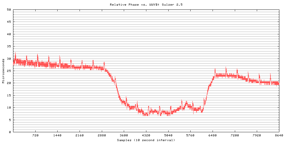
This is a 24 hour plot of the relative phase between the Sulzer standard and WWVB. The vertical scale is expressed in microseconds -- in fact, you can think of this whole exercise as though we're comparing two clocks and figuring out how fast or slow one is relative to the other. The chart shows the phase, or relative position of the clock "tick" of the local and reference signals, and whether the phase changes over time. The difference is expressed in microseconds of phase shift because that's the most convenient way to do it.
If the plot is flat (horizontal) the two oscillators are running at the same frequency; the flat plot means that their phase remains constant with respect to each other. If the plot has an upward or downward slope, that means that the local oscillator is either running too fast (gaining time), or running too slow (losing time), compared to WWVB. The absolute value along the left doesn't have any meaning of its own; it's the change of value that's of interest. (It's useful to know that at the 60kHz WWVB frequency, a drift of one cycle is equivalent to losing or gaining 16.67 microseconds.)
The horizontal axis is data acquisition time. I'm collecting one sample every ten seconds (360 samples per hour).
Almost all the noise you see on the plot is due to irregularities generated by the atmosphere as the WWVB radio signal travels from Fort Collins, Colorado, to Dayton, Ohio. The little "pips" that appear once per hour are a form of station identification -- WWVB advances the phase of its signal by 45 degrees (or about 2 microseconds) at 10 minutes after each hour, and returns it to normal at 15 minutes after the hour. This provides a marker that guarantees you're monitoring the right signal.
You'll see that although the plot is pretty flat (that old Sulzer is doing a good job), there is one decrease over a period of a couple of hours, and an increase several hours later. That's a "diurnal" phase shift that occurs during the times when sunset and sunrise progress between the transmitter and receiver. As the sun goes away, the ionization of the atmoshpere changes (essentially lowering the altitude at which reflection takes place) and this changes the effective length of the radio path, which in turn causes the arrival time of the radio waves to change. It doesn't really impact our ability to track time, because the downward shift in the morning should cancel out the previous evening's upward shift and bring things back to normal.
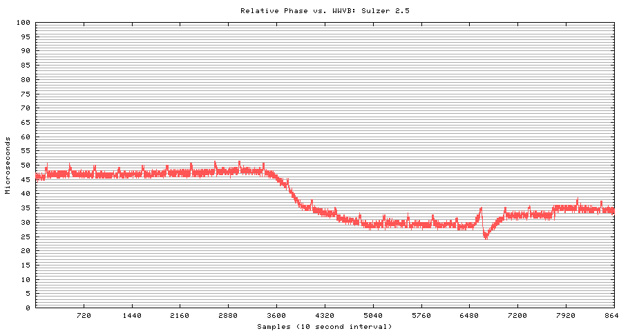
Here's another, similar plot (note, though, that the vertical scale is different than the chart above). You'll notice, though, that this time the phase does not recover to the same value as it had prior to the diurnal shift. There's also a very sharp downward change in phase at about dawn; if you look carefully, you'll see that the amount of the jump is about 16.6 microseconds. Not coincidentally, that happens to be the length of one cycle at 60kHZ.
What happened is that the Fluke receiver "lost lock" on the signal at that point, and "dropped a cycle." The oscillators didn't really lose or gain that much time against each other, they just slipped their synchronization one notch. In analyzing the data, you'd simply add 16.67 microseconds to each reading after the slipped cycle. It's very easy to see a slipped cycle on the chart, but it's surprisingly difficult to write a data filter program to reliably catch the slip and compensate for it automatically. This is one place where the eye and brain do a better job than a computer!
To use charts like these for frequency calibration, you note the change in relative phase between two points, and compare that to the elapsed time between the points. For example, a change of 10 microseconds in 6 hours is equal to a frequency offset of about 4.5x10⁻¹⁰ (4.5 parts in 10-10).
As you can imagine, calibrating frequency using WWVB is a slow process; to measure down to the capability of a VLF system (about one or two parts in 10-11), you need to measure for a day or longer. Most high-accuracy measurements are done over one or more 24 hour cycles running (ideally) from local noon to local noon; the signal is more stable in the daytime than at night, so daytime measurements tend to be more accurate.
Because of these long measurement times, the noise that's shown on the plot above isn't really meaningful; measurements over seconds or minutes don't have much value with this method.
If you are really bored and want to see more detailed information, and (maybe) live data showing how close my frequency standard is RIGHT NOW, check out Live Data Plots.